Last updated: March 2026
GitKraken Insights dashboards display engineering metrics from connected repositories, pull requests, CI/CD pipelines, and AI coding tools. Dashboards require completing Insights onboarding and importing at least one repository. GitKraken Insights is available as an add-on to GitKraken subscriptions or as a standalone product by request.
Quick Start
Dashboards support filtering by Workspace, repository, timeframe, and team.
To add metrics to a dashboard:
- Complete Insights onboarding by connecting a data source and importing repositories. See the Getting Started guide.
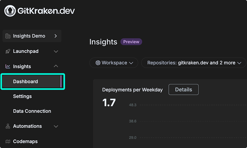
- Open gitkraken.dev and navigate to Insights > Dashboard.
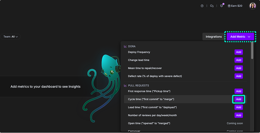
- Click Add Metric in the top-right corner.
- Browse metric categories: DORA, Pull Requests, AI Impact, Code Quality, or Velocity/Delivery Consistency.
- Click Add next to the desired metric to place it on the dashboard.
- Resize widgets by dragging the lower-right corner. Reorder them by dragging the upper-left handle.
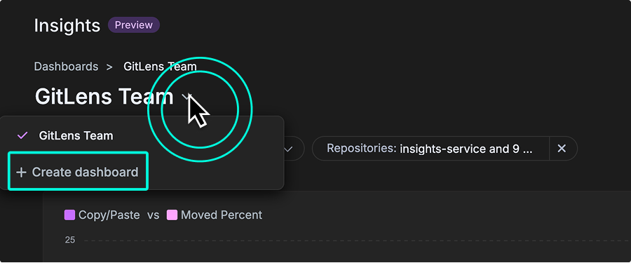
To create a separate view scoped to a team or project, select + Create dashboard from the dropdown in the top-left corner. Each dashboard supports one copy of each metric.
What GitKraken Insights dashboards show
GitKraken Insights brings your Git data, pull requests, issues, and CI/CD results into one place. Instead of juggling tools or exporting spreadsheets, you get dashboards that show how work is really moving across code, reviews, and releases. The goal is to give both devs and leads a clear view of progress and bottlenecks without extra reporting overhead.
Key benefits
- In your workflow: Metrics come straight from the tools you already use: Git, PRs, CI/CD, issue trackers. No duplicate work, no disruption.
- Useful context: See how code changes connect to tickets, review quality, and team goals. Less vanity stats, more signal.
- Clear next steps: Spot inefficiencies and get practical ways to improve, whether it’s review speed, investment in features vs. fixes, or build times.
Adding Metrics
Before you can add metrics, complete these setup steps:
- Request a guided tour to get access.
- Connect GitKraken Insights to your GitHub account.
- Wait for your repositories to finish importing. For detailed instructions, see the Getting Started guide.
Once setup is complete, open the Insights > Dashboard tab from gitkraken.dev.
Creating Dashboards
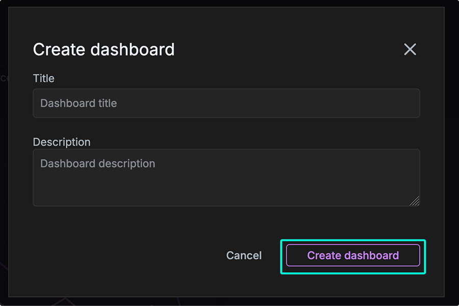
You can create multiple dashboards in GitKraken Insights to organize metrics by team, project, or focus area. To begin, use the dropdown menu in the top-left corner of the dashboard view. From there, select + Create dashboard to open the creation modal.
In the modal, enter a Title and optional Description to help distinguish this dashboard from others. Creating focused dashboards is especially helpful for tracking metrics by repository group, product area, or individual contributor activity.
Add a metric
- In the Dashboard view, click the Add Metric button in the top-right corner.
- Browse the list of available widgets, grouped by category (for example, DORA and Pull Requests).
- Click Add next to the metric you want to display on your dashboard.
Available metrics
| Metric | Category | Unit | Use when you need to… |
|---|---|---|---|
| Deploy Frequency | DORA | Deployments per period | Measure how often code reaches production |
| Change Lead Time | DORA | Days | Track time from first commit to deployment |
| Mean Time to Repair | DORA | Hours | Measure incident response and recovery speed |
| Defect Rate | DORA | Percentage | Assess deployment stability and failure rate |
| First Response Time | Pull Requests | Hours | Identify delays in initial PR review engagement |
| Cycle Time | Pull Requests | Days | Measure total time from first commit to merge |
| Lead Time | Pull Requests | Days | Measure total time from first commit to deployment |
| Number of Reviews | Pull Requests | Count per period | Track review activity and reviewer workload |
| Open Time | Pull Requests | Days | Isolate the review and approval phase duration |
| PRs Abandoned | Pull Requests | Count | Detect wasted effort or scope management issues |
| PRs Merged Without Review | Pull Requests | Count | Identify gaps in code review enforcement |
| PR Comments | Pull Requests | Count | Gauge review depth and collaboration intensity |
| PR Size/Effort | Pull Requests | Lines changed | Evaluate review load and identify oversized PRs |
| Code Review Hours | Pull Requests | Hours | Assess team investment in code review |
| Copy/Paste vs Moved | AI Impact | Percentage | Distinguish duplication from healthy refactoring |
| Duplicated Code | AI Impact | Lines | Track redundant code blocks across repos |
| Code Rework | AI Impact | Percentage | Identify instability or premature code changes |
| Post PR Work | AI Impact | Lines | Measure rework needed after merging |
| Active Users | AI Impact | Count | Track AI coding tool adoption across teams |
| Suggestions | AI Impact | Lines | Measure volume of AI-generated code suggestions |
| Prompt Acceptance Rate | AI Impact | Percentage | Gauge developer trust in AI suggestions |
| Tab Acceptance Rate | AI Impact | Percentage | Measure frictionless AI suggestion adoption |
| Bug Work Percent | Code Quality | Percentage | Assess proportion of effort spent on bug fixes |
| Documentation and Test % | Code Quality | Percentage | Monitor investment in tests and documentation |
| Code Change Rate | Code Quality | Lines by age | Identify technical debt hotspots in older code |
| Code Change by Operation | Code Quality | Lines by type | Visualize effort distribution across system layers |
| Commit Count | Velocity | Count | Track development activity volume |
| Estimated Coding Hours | Velocity | Hours | Approximate total active development time |
Use Cycle Time to measure from first commit to merge (development speed). Use Open Time to isolate just the review phase (review efficiency). Use Lead Time to measure from first commit to deployment (end-to-end delivery).
DORA metrics
DORA (DevOps Research and Assessment) metrics are a standardized set of four key performance indicators: deployment frequency, lead time for changes, change failure rate, and time to restore service.
Developed by a Google Cloud research team, these metrics help organizations measure DevOps performance, identify areas for improvement, and deliver software more efficiently and reliably.
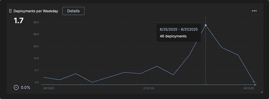
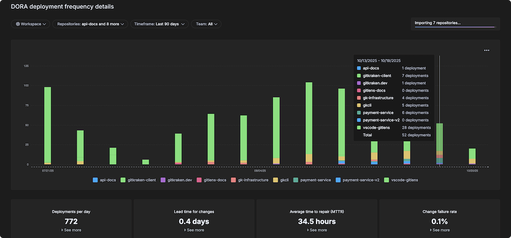
Deploy Frequency
Definition: The total number of deployments, as determined by the rules configured in the Releases settings.
This metric shows how often new code is released or deployed to production, measured as the number of deployments per day, week, or other selected timeframe.
In addition to the main chart, the following submetrics are displayed when you click the Details button:
- Deployments per day
- Lead time for changes
- Average hours to repair (MTTR)
- Change failure rate
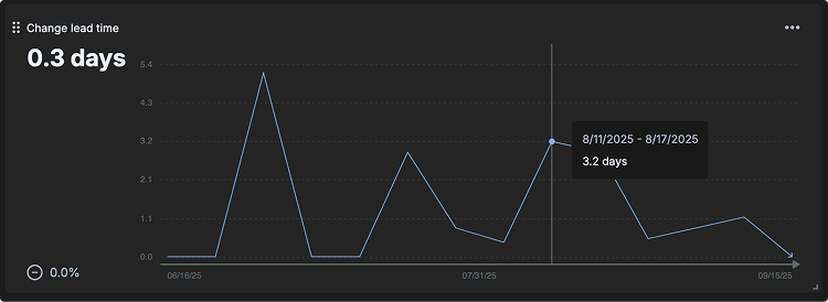
Change Lead Time
Definition: The time between the first commit linked to an issue (such as a Jira ticket) and when the associated code is deployed.
This metric shows how long each pull request within a selected timeframe took to go from the first commit until it was deployed. Values are expressed in days and are calculated over a rolling 7-day period.
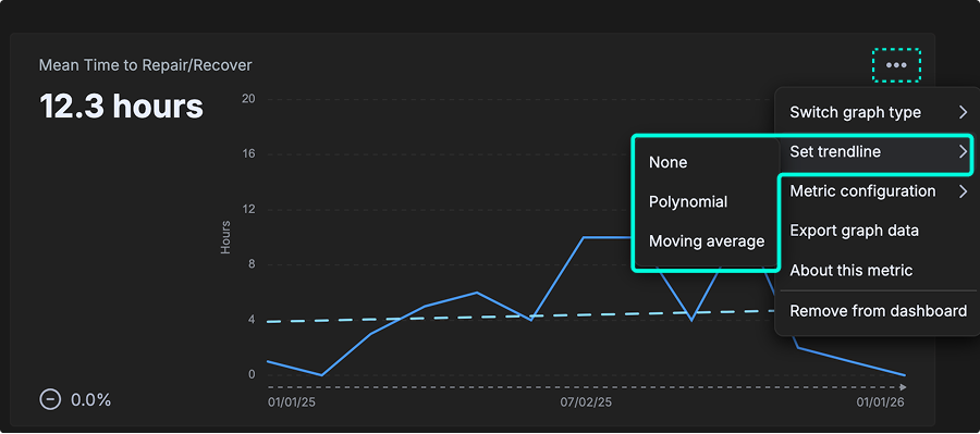
Mean Time to Repair/Recover (MTTR)
Definition: Business hours between “defect detected” and “final fix deployed”.
This metric shows how long each pull request within a selected timeframe took to go from the first commit until it was deployed. Values are expressed in days and calculated over a rolling 7-day period. Lower MTTR indicates that teams can respond quickly to incidents and minimize downtime.
Defect Rate
Definition: The percentage of deployments that resolve a critical defect. This metric measures the stability and quality of your deployment process.
This metric shows the number of defects detected over time. Values are expressed as defects over a rolling 7-day window. A lower defect rate indicates a more stable and reliable deployment process.
Pull Request metrics
Pull Request metrics help teams understand how quickly and smoothly code changes move through review and deployment.
PR intelligence turns these insights into clear actions by highlighting slowdowns, spotting patterns in fast or delayed reviews, and uncovering blockers that may affect delivery.
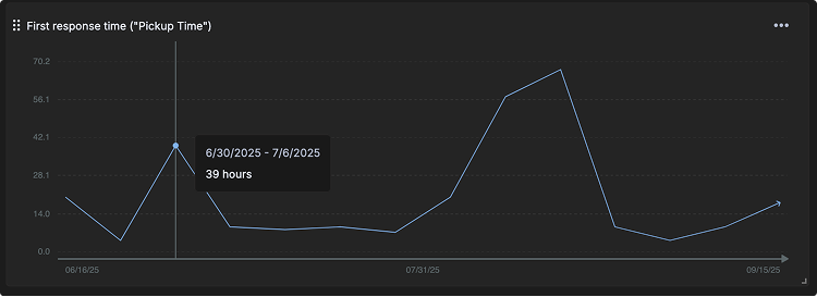
First Response Time (“Pickup Time”)
Definition: The time measured from when a PR is opened to when the 1st review or comment is left on a PR.
This metric shows how long each pull request within a selected timeframe took to have a first response (comment, review or approval). Values are expressed in hours and averaged over a 7-day period. Shorter pickup times indicate faster reviewer engagement and healthier collaboration.
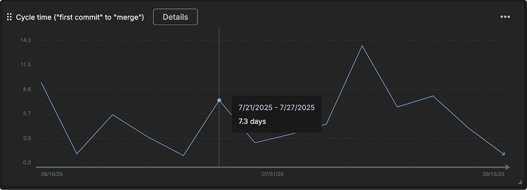
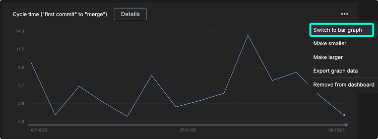
Cycle Time (“first commit” to “merge”)
Definition: The time measured between the 1st commit of a PR to when the PR is merged.
This metric shows how long each pull request within a selected timeframe took to merge from the time the first commit (authored local timestamp) was made. Values are expressed in days and averaged over a 7-day period. Cycle time provides insight into overall delivery speed, highlighting how quickly work moves from coding to production.
The Details view offers deeper analysis.
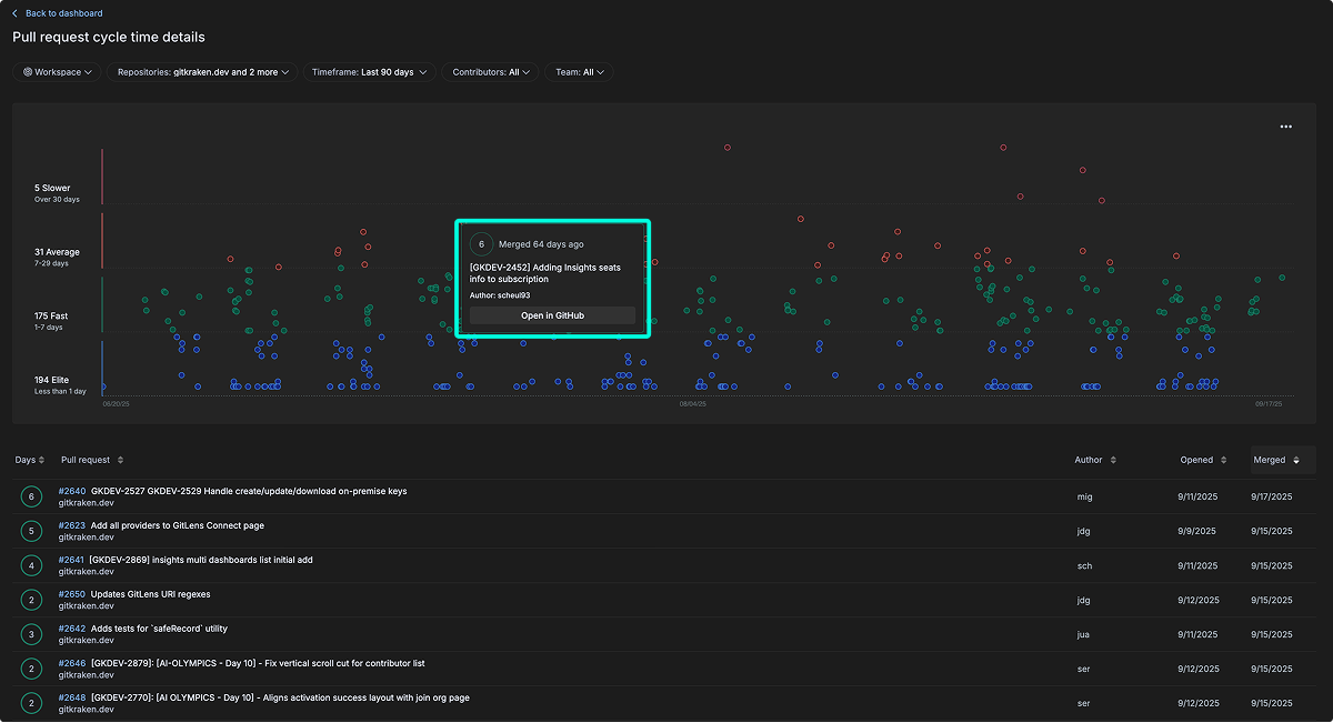
- Pull requests are grouped into four categories by duration:
- Elite: Less than 1 day
- Fast: 1–7 days
- Average: 7–29 days
- Slower: Over 30 days
- Each node in the scatter plot is interactive, showing PR details such as time since merge, PR name, author, and a link to open directly in GitHub.
- A sortable table lists all PRs below the chart. You can sort by Days, Pull Request name, Author, Date Opened, or Date Merged.
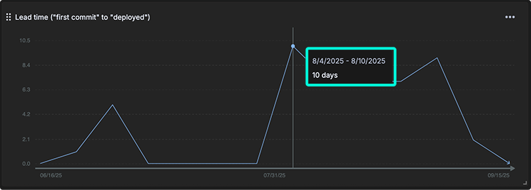
Lead Time
Definition: The time from the first commit in a pull request to when that code is deployed to production. This bridges development and deployment activities.
This metric shows how long each pull request within a selected timeframe remained open, measured from when the PR was created until it was merged. Values are expressed in days and averaged over a 7-day period.
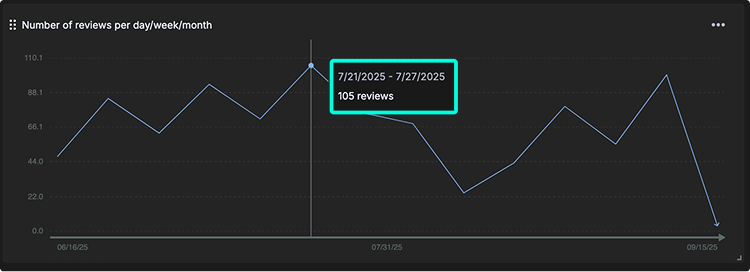
Number of Reviews per Day/Week/Month
Definition: The volume of code reviews being conducted, indicating team review capacity and activity.
This metric shows the total number of reviews (all types) completed over a given period of time. Values are expressed in reviews and averaged over a 7-day window. Tracking review activity helps teams understand collaboration patterns and reviewer workload across different timeframes (daily, weekly, or monthly).
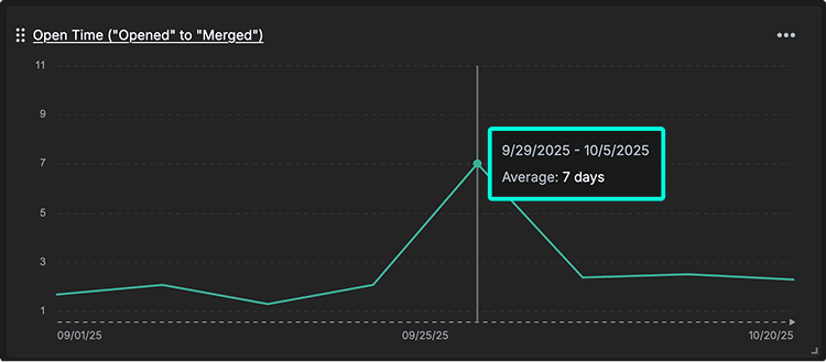
Open Time (“opened” to “merged”)
Definition: The time between when a pull request is opened and when it is merged.
This metric captures the duration from pull request creation to merge. It differs from PR Cycle Time, which starts from the first commit. Open Time isolates the review and approval phase, helping teams identify delays specifically related to code review and collaboration workflows.
The Open Time details view provides a stacked bar chart that visualizes average PR open durations per repository across time intervals. Each bar segment represents a specific repository, allowing teams to compare performance across services.
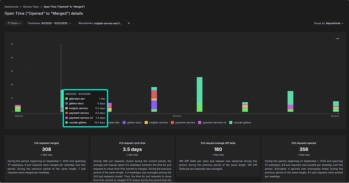
Key highlights include:
- Hover insights: Hovering over bars shows per-repository open time for the selected week.
- Repository comparison: See how review duration varies across services.
- Summary metrics:
- Pull requests merged
- Pull request cycle time
- Pull request average diff delta
- Pull requests opened
These metrics help teams identify trends, uncover review bottlenecks, and monitor efficiency over time.
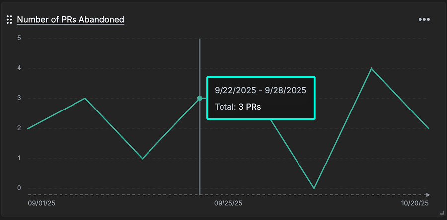
Number of PRs Abandoned
Definition: Number of pull requests closed without being merged.
This metric can reveal wasted engineering effort, scope management issues, or breakdowns in work planning and prioritization. A high abandonment rate may indicate unclear requirements, excessive rework, or bottlenecks earlier in the development process.
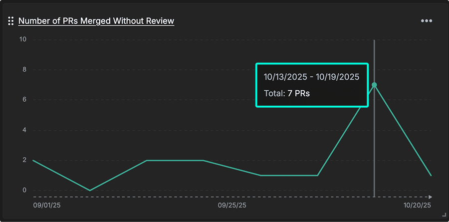
Number of PRs Merged Without Review
Definition: The number of pull requests that have been merged without any (bot or human) review.
This metric can indicate potential process gaps in peer review enforcement. It identifies PRs integrated without peer review, exposing quality risks and gaps in your code review governance that could lead to production defects.
Number of PR Comments
Definition: The total number of comments left on your pull requests.
This metric measures the level of engagement during code reviews, revealing how thoroughly code is being evaluated. A high number of comments can indicate active feedback, knowledge sharing, and mentorship opportunities across the team.
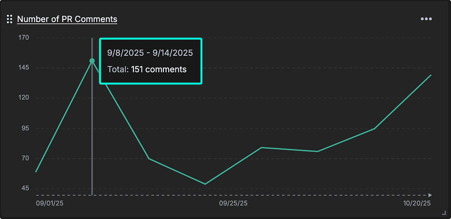
Currently, this metric counts all comments, including those from bots. Future updates may allow filtering by comment type to focus on human feedback.
PR Size / Effort
Definition: The aggregate amount of change (diff delta) across all pull requests that were merged during a given time period.
This metric reflects the total effort involved in the review process. It is calculated by summing the “Before PR submitted” and “While under review” diff delta values, representing the total size of the pull request and the energy required for its review.
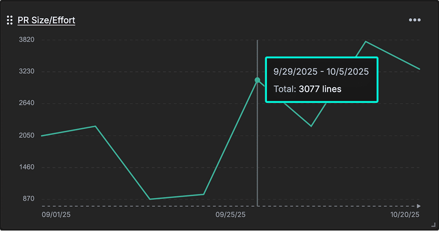
By aggregating the total change volume across merged PRs, this helps teams balance workload distribution and recognize when PRs may be too large for effective review.
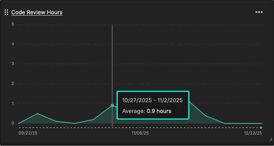
Code Review Hours
Definition: Average time spent in hours during the “review period” of your team’s pull requests.
How it’s calculated: Total review hours / number of committers.
This metric quantifies the average time investment in reviewing code. It helps leaders evaluate whether code review capacity aligns with delivery goals and whether review processes need optimization to support team velocity and quality.
AI Impact
AI Impact metrics help teams understand how AI coding tools affect code quality and developer efficiency. By tracking rework, duplication, and post-PR changes, teams can see measurable improvements in code and workflow, proving ROI and guiding smarter use of AI tools.
Copy/Paste vs Moved Percent
Definition: This metric compares how much code is duplicated versus refactored or relocated over time. Moved lines reflect healthy code reorganization, while copy/pasted lines often signal duplicated logic that can lead to technical debt.
Tracking this metric helps teams distinguish between maintainable refactoring and potentially problematic duplication. This is especially important for teams using AI coding assistants, which tend to duplicate code rather than abstract or reuse it—leading to higher long-term maintenance costs if left unchecked.
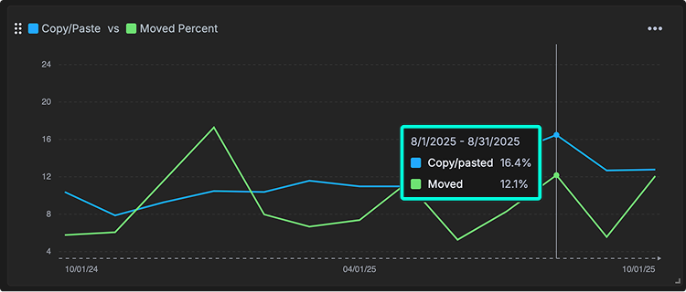
You can hover over points on the chart to view the exact percentages for a specific time period, making it easy to see changes before and after implementing an AI coding tool.
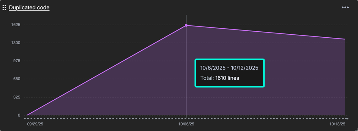
Duplicated Code
Definition: The amount of lines in duplicate blocks detected.
This metric measures redundant code blocks in your codebase. It correlates with increased maintenance costs and a higher risk of defect propagation, since duplicated logic must be updated consistently across multiple places.
When duplication rises, it often signals that AI-assisted or manual coding practices are reusing code without enough refactoring.
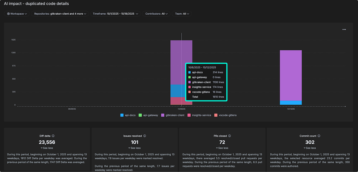
The detailed view breaks this down by repository and time period, showing where duplication is concentrated and how it changes alongside overall development activity, such as commits, pull requests, and issues resolved. This helps teams connect code duplication trends to broader workflow patterns and assess the real impact of AI tools on code quality.
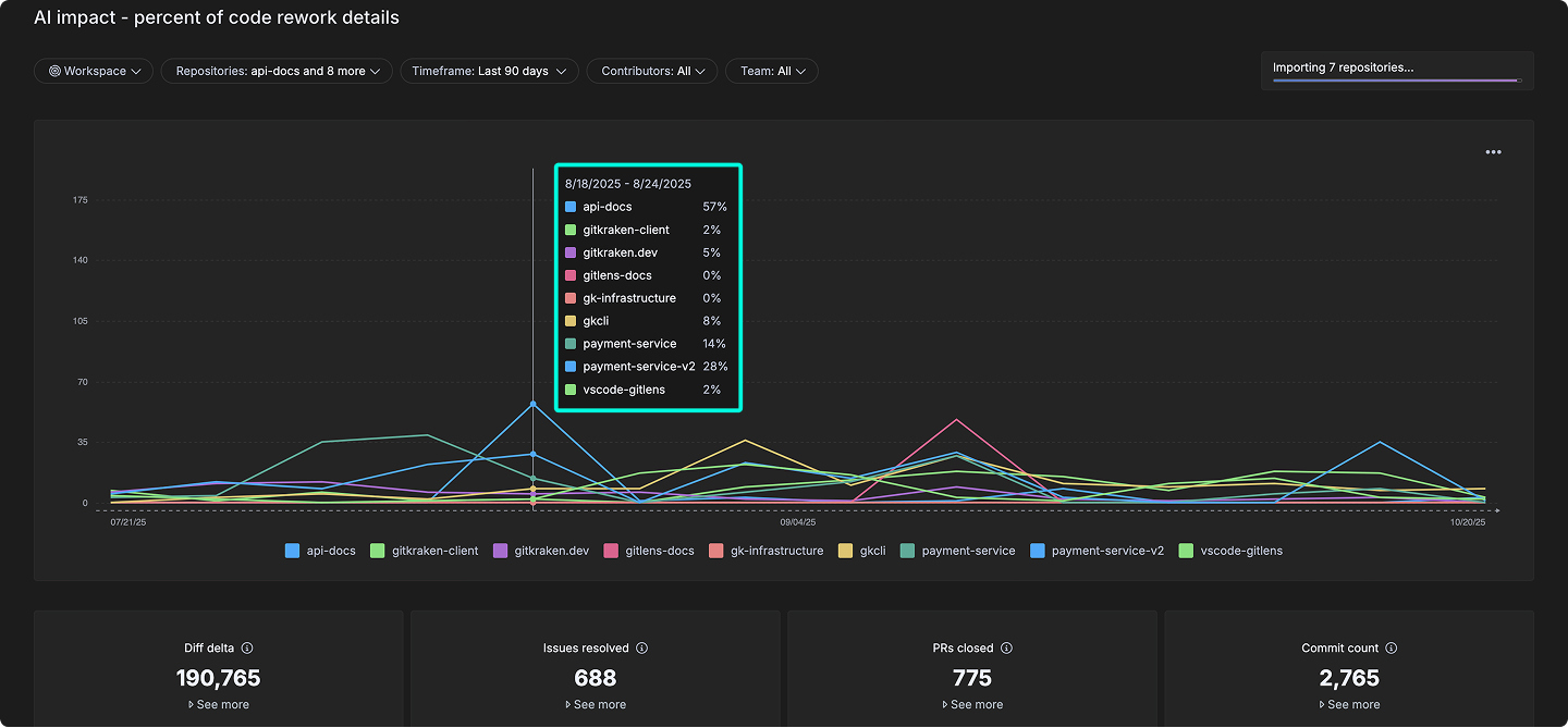
Percent of Code Rework (Churned Lines)
Definition: The percentage of recently written code that gets modified again quickly, which may indicate instability or changing requirements.
This metric calculates how much recently written code gets modified again, signaling instability, shifting requirements, or potential quality issues. High churn rates can reflect rework caused by unclear goals, rushed reviews, or limitations in AI-assisted code generation.
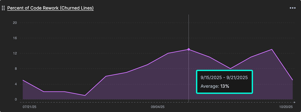
The detailed view breaks this down across repositories and time periods, helping teams see where rework is concentrated and how it aligns with activity levels like commits, pull requests, and issue resolutions. By monitoring this metric, teams can assess whether AI tools are improving long-term code quality or introducing avoidable rework.
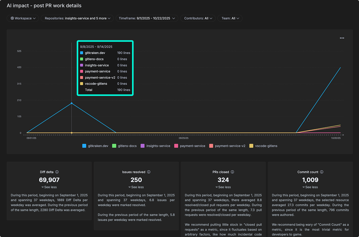
Post PR Work Occurring
Definition: Follow-up work and bug fixes needed after merging, indicating the initial quality of AI-assisted code.
This metric quantifies rework and fixes needed after a pull request is merged, providing an early signal of code quality. It is especially useful when evaluating AI-assisted development, where code may pass initial review but still require corrections post-merge.
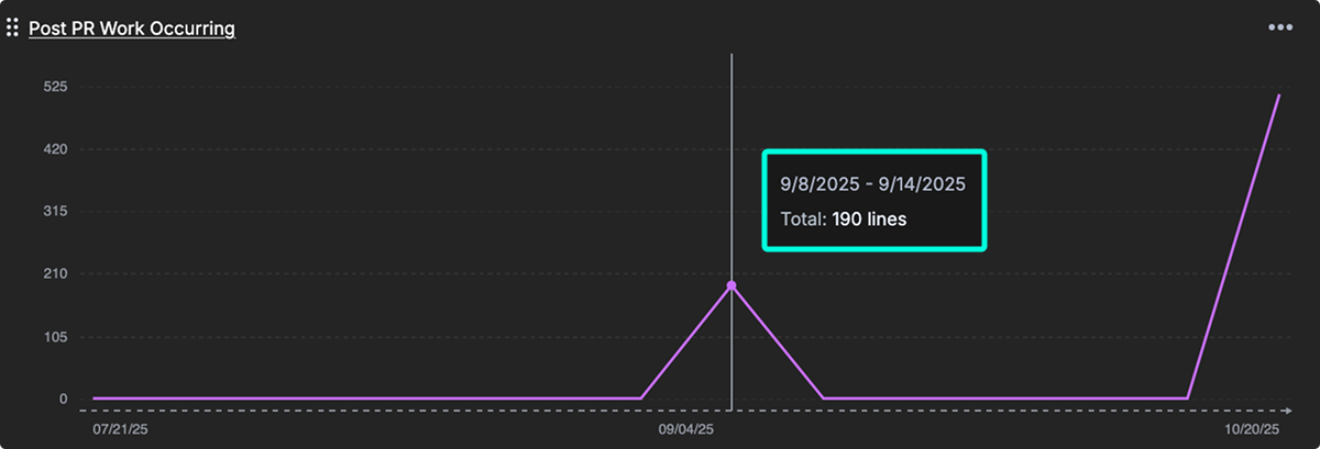
The detailed view breaks this activity down by repository and time period, revealing patterns in post-merge changes and how they relate to broader development activity, such as commits and pull requests. Tracking this metric over time helps teams improve review quality and identify whether AI-assisted coding leads to more—or less—post-merge rework.
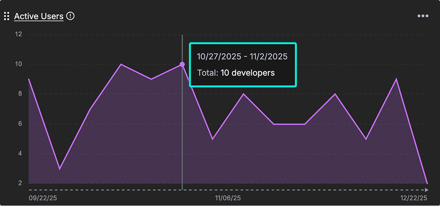
Active Users
Definition: The total count of unique users active in the connected AI provider integrations.
This metric counts developers actively using AI coding assistants from connected providers. It establishes a baseline for tracking AI adoption across your teams and supports analysis of AI tool investment impact and developer productivity trends.
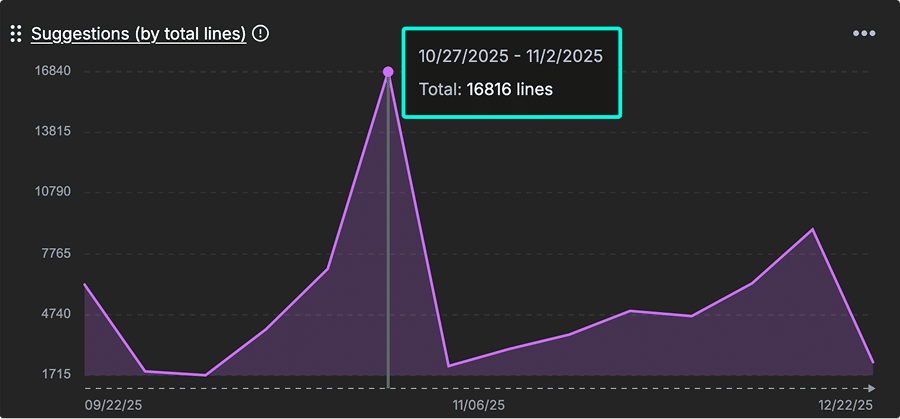
Suggestions (by total lines)
Definition: The number of suggestions offered from your connected AI provider integrations.
This metric tracks the volume of AI-generated code suggestions offered to developers. It provides scale context for measuring the extent of AI contribution to overall development output and helps teams evaluate how heavily AI is being leveraged in the coding process.
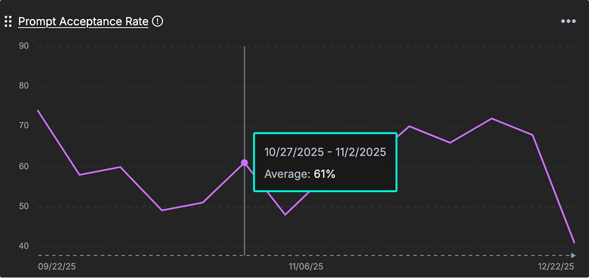
Prompt Acceptance Rate
Definition: The percentage of prompt results a developer accepted from your connected AI provider integrations.
This metric measures how many AI-generated code suggestions are accepted by developers. A higher rate indicates stronger alignment between AI outputs and developer expectations, signaling trust and effectiveness in AI-assisted workflows.
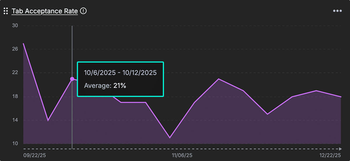
Tab Acceptance Rate
Definition: Measures what percentage of AI-generated code suggestions developers accept with tabs.
Like prompt acceptance, this metric reflects the effectiveness and usability of AI suggestions. A higher tab acceptance rate indicates that developers find the suggestions useful and frictionless to apply, helping gauge the seamlessness of AI integration in development workflows.
Code Quality
This section presents metrics designed to assess and improve engineering quality. Together, they offer a balanced view of code health by examining how much work is spent on bugs, tests, and documentation, how frequently older code is modified, and how engineering effort is distributed across different parts of the system.
Use these metrics to monitor technical debt, maintain development quality, and align team investments with maintainability and product stability goals.
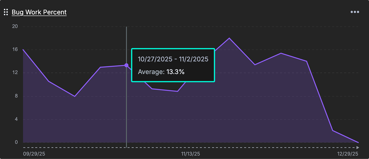
Bug Work Percent
Definition: The ratio of development work spent on fixing bugs vs everything else.
This metric reveals the proportion of engineering work consumed by fixing defects versus feature development. It helps leaders assess the level of code quality debt and prioritize efforts toward refactoring and process improvements.
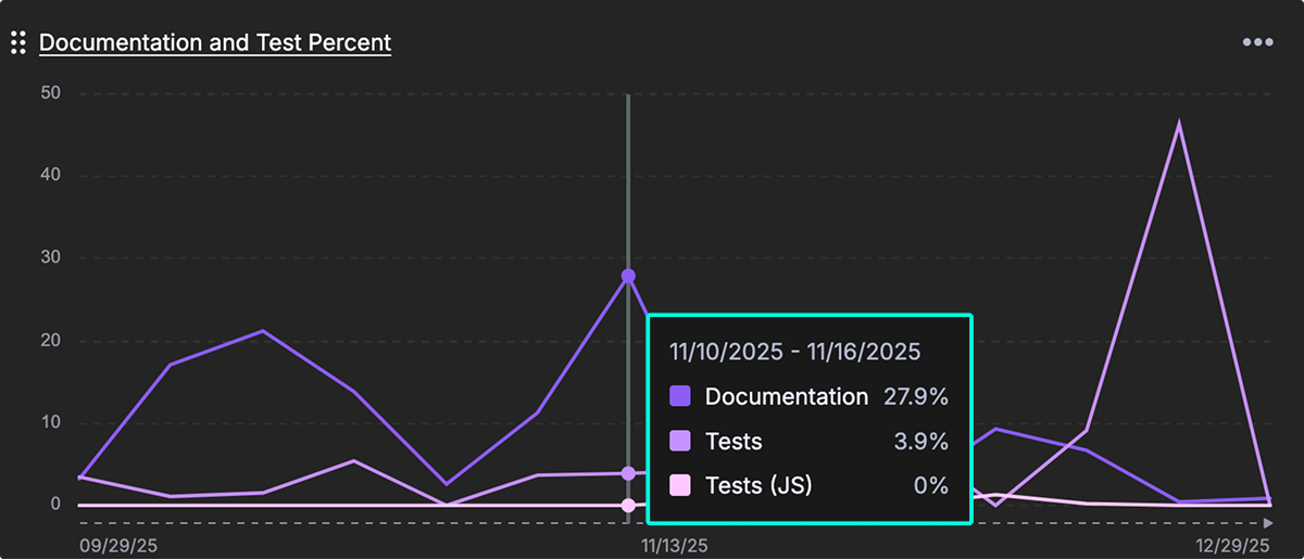
Documentation and Test Percent
Definition: The percent of work related to tests and documentation.
This metric shows the proportion of engineering work dedicated to writing tests and documentation. These activities are strong indicators of long-term maintainability and help improve onboarding efficiency, especially in growing or distributed teams.
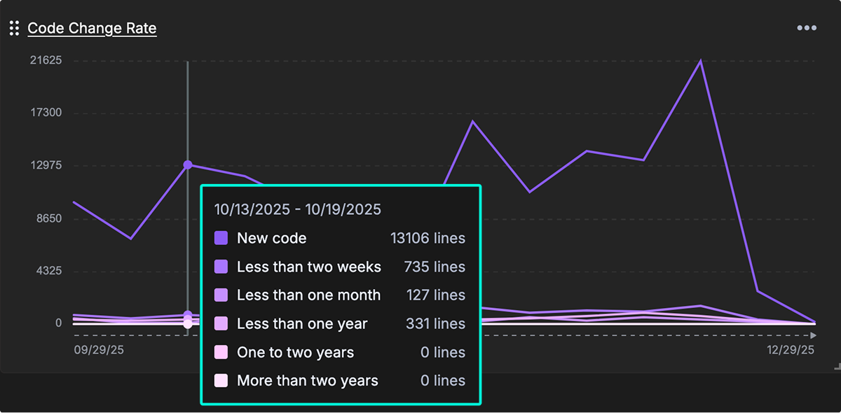
Code Change Rate
Definition: How old the code is that is being changed.
This metric tracks the age of code being modified. Frequent changes to older code may reveal technical debt hotspots, signaling the need for deeper refactoring or even system replacement. Teams can use this data to prioritize stability improvements and architectural upgrades.
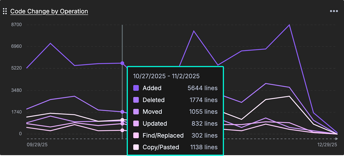
Code Change by Operation
Definition: The measure of code changes organized by the type of change. (e.g., “test,” “documentation,” “front-end,” “back-end”)
This metric breaks down engineering work by category, such as testing, documentation, front-end, and back-end development. It helps teams visualize where their effort is being spent and supports more strategic allocation of resources across system layers and quality activities.
Velocity/Delivery Consistency
This section highlights metrics that reflect development rhythm and consistency. Tracking commit volume and coding hours helps teams assess delivery patterns and ensure developers have time for focused work.
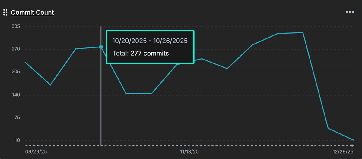
Commit Count
Definition: The number of commits pushed to all connected repositories.
This metric tracks the volume of code commits over time, offering a basic signal of development activity. While not a productivity metric on its own, it can help identify engagement patterns, team rhythm, and delivery frequency.
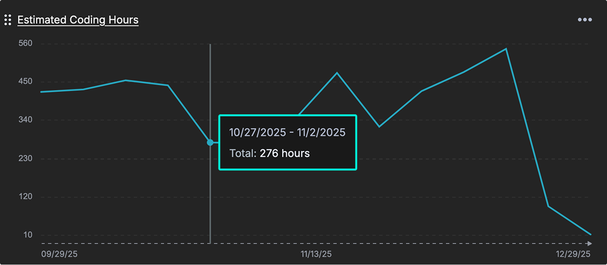
Estimated Coding Hours
Definition: Estimates the amount of time a team’s developers spend coding.
This metric approximates the total active development time across your team. It helps leaders assess engineering capacity, detect shifts in focus time, and understand whether developers are able to engage in deep work versus being blocked or interrupted.
How to customize dashboard layout
Widgets on the dashboard can be customized to fit your needs.
- Resize widgets: Each widget is available in two sizes—small or large. Drag and drop the lower-right corner of a widget to adjust its size.
- Rearrange widgets: Drag and drop from the upper-left corner of a widget to move it into a new position on the dashboard.
- One per dashboard: Only one copy of each metric can be placed on a dashboard.
- Widget menu: From the menu in the upper-right of each widget, you can switch between line and bar graph types, resize the widget between large or small, export the graph data, or remove the widget from the dashboard.
- Switch graph type Switch between line graphs, area graphs, or bar graphs.
Note: Currently, each user can create only one dashboard per organization. Support for multiple dashboards per user is planned for a future release.
How to add trendlines to charts
You can add trendlines to any chart in GitKraken Insights to help visualize patterns over time. These overlays make it easier to understand whether your metrics are improving, declining, or fluctuating—and how consistently.
How to add a trendline
- On any dashboard widget, click the ⋯ (three dots) menu in the upper-right corner.
- Select Set trendline.
- Choose one of the available types:
- None: No trendline is shown.
- Linear: Adds a straight line through the data to show steady upward or downward trends.
- Polynomial: Adds a curved line that reveals acceleration, deceleration, or changing directions in the data.
- Moving Average: Smooths out short-term fluctuations to highlight the overall pattern, especially useful for noisy or jumpy data.
Tip: Use trendlines to spot steady improvements, regressions, or shifts in behavior across delivery, review, or quality metrics.
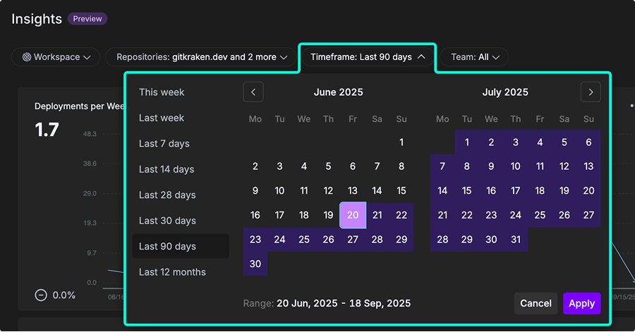
How to filter dashboard data
The dashboard may be filtered by Workspace, Repositories, Timeframe, and Team.
-
Workspace: Workspaces are preset groups of repositories. They also enable other key features across gitkraken.dev, GitKraken Desktop, GitLens, and the GitKraken CLI such as Launchpad and multi-repo actions. On the dashboard, you can filter to only display data for the repositories in your chosen Workspace. To create your first workspace, go to gitkraken.dev/workspaces.
-
Repositories: Refers to the list of repos imported into GitKraken Insights. Check or uncheck repositories to fine-tune the data. Use the search feature to quickly locate repos by name.
-
Timeframe: Sets the timebox for the dashboard. Options include This Week, Last Week, Last 7 days, Last 14 days, Last 28 days, Last 30 days, Last 90 days, Last 12 months, or a custom date range.
-
Team: Filters the data by a group of users. To configure teams, go to Insights > Settings > Setup your Team.