
Last updated: June 2026
GitKraken Insights is the dashboard your engineering organization uses to see — in one place — how AI tools, code delivery, and team capacity actually interact. This section gets you oriented in about ten minutes.
What this product does, in one sentence
It connects your GitHub, your AI coding tool telemetry (Claude Code, Codex, Cursor), your Jira customer bugs, and your BambooHR PTO calendar, and produces a small set of trustworthy numbers for engineering leadership.
What this product does not do
- It does not rank or compare individual developers against each other for performance reviews. The scoring framework is designed for trend reading and cohort comparison, not for slotting people on a curve.
- It does not replace your standup, your retro, or your one-on-ones. It surfaces patterns that should become conversations.
- It does not produce real-time alerts. The numbers refresh on a window (default 14 days) and are designed for weekly / monthly / quarterly review.
Three pages that matter most
If you take only one thing from this guide, take this: there are three pages that will answer 80% of the questions you’ll have on a given day.
| Page | When to use it |
|---|---|
| /teams (the default landing) | Weekly leadership review. Team-by-team adoption and delivery, side by side. |
| /developers | When you want to drill into individuals: who’s a Power User, who’s struggling to adopt, who needs onboarding. |
| /executive | Monthly or quarterly reports up the chain. Pre-shaped for execs with hero KPIs and trend lines. |
The other pages (/impact, /ai-impact, /comparison, /flow-delivery, /capex, /data, /board-metrics, /settings) are deep-dive surfaces for specific questions. Once you have the three above in your reading habit, the others slot in naturally.
Pick your starting point
Quickstarts for the four roles we built this for. Each takes 5–10 minutes.
- For executives — the four numbers that tell the story; how to read a monthly summary in 60 seconds.
- For engineering leaders — running a quarterly review using AI Tier, Output Score, and Cycle Time together.
- For team leads — your weekly pulse using the Flow + Team + Review tabs on /flow-delivery.
- For admins — settings, roster, integrations, and how to keep the data clean.
Or jump straight into product:
- Reading your first dashboard — a guided walkthrough of /teams.
How to think about developer scores
A short philosophy note, because scores invite misuse.
Every developer in GitKraken Insights gets sorted into one of five tiers:
| Tier | Composite score | What it means |
|---|---|---|
| Power User | ≥ 80 | Using AI consistently and shipping at the org’s top rate |
| Regular | 55–79 | Healthy adoption and steady output |
| Explorer | 25–54 | Trying AI but not yet routine |
| Emerging | < 25 | Minimal AI engagement |
| On PTO | (override) | Was on PTO for every weekday in the window — excluded from averages |
The tiers describe patterns of engagement and delivery, not “who’s a good engineer.” A senior developer working on a hard, isolated infrastructure project for a quarter may show as Emerging because the work doesn’t suit AI tooling. A junior developer pairing constantly with Cursor on UI changes may show as a Power User. Neither tells you who deserves a promotion.
What the tiers do tell you:
- Adoption trajectory. How many developers crossed from Emerging → Explorer last quarter?
- Cohort gaps. Are your Power Users concentrated on one team while another team is stuck at Explorer?
- Onboarding signal. New hires landing in Emerging after 6 weeks is a process flag, not a person flag.
- Org-level maturity. What % of your team is at Regular or above? That’s your AI rollout report card.
When in doubt: don’t read a single developer’s score in isolation. Read the cohort.
A note on benchmarks
You’ll see ranges throughout the help center labeled “Strong / Fair / Needs attention.” These reflect our defaults and what we see across the orgs running Insights. They are not industry benchmarks. Engineering productivity has no good universal benchmarks — every team’s context matters too much — so treat the ranges as a starting frame, not a verdict.
Reading your first dashboard
A guided 10-minute walkthrough of /teams, the page you land on when you log in. By the end you’ll know what every column means and where to click next.
Set the scope first
Before you read anything, set two filters at the top of the page:
- Date range. Default is the last 14 days. For weekly reviews keep it at 14 days. For a quarter-end review, switch to 90 days. Sub-7-day windows force some rates to zero, so don’t pick “yesterday” expecting full data.
- Department or team. Pick the slice of the org you care about. If you have a
Default Departmentset in Settings, this comes pre-filled.
Everything below this point will reflect those two filters.
The team table — column by column
The main view is one row per team. Here’s what each column tells you:
Readiness
A composite “is this team set up to succeed with AI?” rating. Combines repository readiness (do they have AI tools wired in?), behavior (are developers actively using AI?), and outcomes (cycle time, output). Read as: green = no help needed, yellow = friction worth investigating, red = blocked.
Avg Adoption
The mean Agent Adoption Score across the team’s active developers. A team average of 50 means a healthy mix; 80+ means a high-adoption team.
Tier mix
Bars showing the team’s distribution across Power User / Regular / Explorer / Emerging. A team can have a great average and still be lopsided — e.g. half Power Users, half Emerging. The tier mix surfaces that.
Cycle Time
Average hours from a PR’s first commit to merge. Lower is generally better, but not always — see the Cycle Time section for nuance.
Output Score (per active dev)
Effort-weighted shipping rate, divided by the number of active developers on the team. A team that ships fewer but bigger PRs can have the same Output Score as a team that ships many small ones. Read this alongside the PR/DC count breakdown to know which pattern you’re seeing.
Power User %
Percentage of the team’s active developers in the Power User tier. Useful for tracking “where is AI adoption already mature” at a glance.
Expand a row to drill in
Click any team row to expand it. You’ll see three tabs:
Repos
Per-repo readiness. Helpful when a team’s Readiness score is dragged down by one specific repo that needs a config update.
Developers
The full developer roster for that team with individual Adoption Scores, Output Scores, AI Tier, and a Direct Commits column. Click any developer to drill further into their profile (this navigates to /developers).
System Metrics
Cycle Time + PR Volume trends for the team. Use the dimension dropdown to break either chart down by author, AI tier, or PR category.
What to look at first
In order, every time:
- Tier mix bars. Are any teams disproportionately Emerging? That’s the leading edge of an adoption problem.
- Avg Adoption vs Output Score. A team with high adoption and low output (or vice versa) deserves a conversation.
- Cycle Time outliers. Anyone over 4 days? That’s almost always a review-bottleneck or WIP problem, not a coding problem.
- Readiness reds. A red Readiness usually means a missing integration or a stale roster — quick to fix.
Where to go next
Now that you’ve read /teams, here are the obvious follow-up pages depending on what you saw:
| If you saw … | Go to … |
|---|---|
| A team with low adoption | /developers, filtered to that team — find the Emerging cohort |
| A team with slow cycle time | /flow-delivery → Flow tab → switch dimension to “phase” |
| A team with high output but low AI | /comparison → compare that team to a high-AI peer |
| A team you don’t recognize | /settings → Teams — check the roster |
| An exec asking “what’s the ROI?” | /ai-impact and /executive |
What the dashboard won’t show you (and why)
- Code quality at the line level. We don’t run static analysis or measure code health beyond cycle metrics. Use your existing tools (SonarQube, Code Climate, etc.) for that.
- Sentiment. A team can have great numbers and miserable morale. The dashboard is one input — your one-on-ones are another.
- Pre-2026-03-05 AI usage. Claude Code OTEL instrumentation started March 5, 2026. Anything earlier is undercounted.
Glossary refresher
- Active developer: is_active = true and shipped at least one PR or direct commit in the window and wasn’t fully on PTO.
- Window: the date range you selected at the top.
- P90: 90th-percentile cap computed across your whole active org. Sets the ceiling for normalized scores.
- Maturity Factor: an org-wide scaling knob (default 0.75). At 0.75, a P90 developer scores 75. Adjusts everyone’s tier ceiling.
For executives
You don’t have time to learn the product. You have time for four numbers and a story. This page is exactly that.
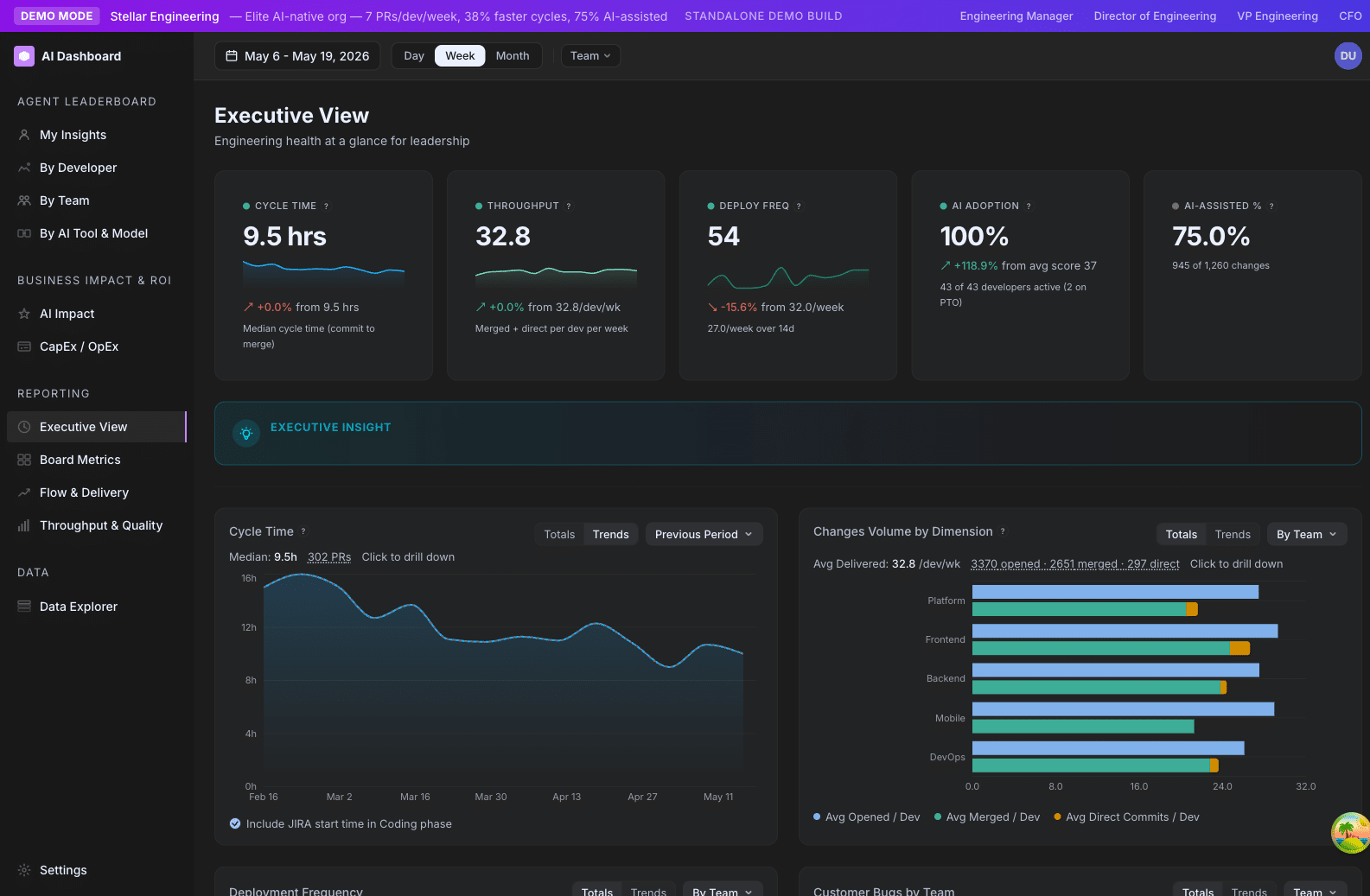
The four numbers
Open /ai-adoption/executive. Five hero cards stretch across the top. The four that matter most:
1. AI Adoption %
Percent of your active developers at Explorer tier or above (score ≥ 25). This is your “how broadly is AI used here?” answer.
Read it as: a leading indicator. Adoption usually moves before output does.
Healthy trajectory: up and to the right, with the curve flattening as it approaches 100%. A flat or declining number deserves an investigation — usually it is onboarding, tooling friction, or a vocal skeptic on a team.
2. AI-Assisted %
Percent of changes (PRs + direct commits, weighted by lines changed) where the developer used AI in or around the change. Different from Adoption %: a developer can have AI installed (counts toward Adoption) without using it on a given change (doesn’t count toward AI-Assisted).
Read it as: a behavioral indicator. The closer this gets to AI Adoption %, the more thoroughly AI is integrated into actual work.
3. Cycle Time
Average hours from a PR’s first commit to merge. The single best operational health metric in the dashboard.
Read it as: a trailing indicator of flow. If cycle time creeps up, look at WIP and review-cycle counts.
4. Throughput
Number of merged PRs per week, normalized per active developer.
Read it as: volume of shipped work. Read alongside Output Score (effort-weighted) — Throughput is “how many things”; Output Score is “how much stuff.”
The fifth card, Power User Growth, is your quarter-over-quarter trend on how many developers moved into the top tier.
How to read the trend lines
The executive view has six trend lines below the hero cards: Cycle Time, Throughput, Deployment Frequency, CFR, AI Adoption, and (when configured) Customer Bugs.
The single most useful reading pattern: look at adoption trend and cycle time trend together.
- Adoption ↑ and Cycle Time ↓ → AI is delivering. This is the story you want to tell.
- Adoption ↑ and Cycle Time flat → AI use is increasing but flow hasn’t caught up. Usually a review-bottleneck issue.
- Adoption flat and Cycle Time ↑ → Operational drag. Investigate WIP, headcount, scope.
- Adoption ↓ and Cycle Time ↑ → Compound problem. Likely a morale or attrition signal — talk to your engineering leaders.
What to put in your monthly report
Three lines, in this order:
- The headline. “AI adoption climbed from 62% to 71% this month, while cycle time dropped from 4.1 to 3.4 days.”
- The story. Why it moved. Did you ship a training? Did a new team onboard? Did you launch Codex alongside Claude?
- The next bet. What you are going to push on next month. “Next month we are focused on the Platform team — currently 40% Emerging, target 70% Explorer+.”
The dashboard’s job is to give you the first two. The third one is your call.
What not to do with the dashboard
- Don’t show individual developer scores in your monthly report. It will get someone fired by a different chain of command than the dashboard was designed for. Aggregate by team or by tier mix instead.
- Don’t read a single week. Engineering work has 2–4 week natural cycles. Read trends, not weeks.
- Don’t quote ROI to the dollar. The Productivity Uplift number is a directional estimate. Use it for order-of-magnitude statements (“low single-digit millions in annualized productivity gain”), not for finance.
Where to drill further
If you want one more level of detail:
- For “is AI actually paying off?” → Productivity Uplift
- For “where are we slow?” →
/ai-adoption/ai-impact(Cycle Time phase breakdown) - For “which team needs attention?” →
/ai-adoption/teams
For engineering leaders
You run multiple teams. You have a board meeting next week and a 1:1 with your VP the week after. This guide is how to extract the right answers in 30 minutes flat.
Your weekly 10-minute scan
Every Monday morning, open /teams with the date range set to the last 14 days. Look at three things:
- Tier mix bars. Are any teams disproportionately Emerging or Explorer? That’s a leading indicator of an adoption problem you can intervene on this week.
- Cycle Time outliers. Any team over 4 days? Click in — almost always it’s a review bottleneck (high review cycles) or a WIP problem (too many open PRs), not coding speed.
- Output Score swings. A team’s Output Score down 30% week-over-week deserves a check-in. Usually it’s a quarter-end shift in priorities, but sometimes it’s a process breakage.
If nothing flagged, you’re done. If something flagged, drill into the team’s expanded row → System Metrics tab.
Your quarterly review
A 45-minute structured review using four pages. Do this once per quarter with your engineering leadership group.
Step 1 — Org-level AI rollout health (5 min)
Open /executive. Note: AI Adoption % current vs. last quarter, Power User % current vs. last quarter, AI-Assisted % current vs. last quarter.
Question to answer: Did we move the rollout forward this quarter? If yes, by how much and on which teams? If no, what’s blocking us?
Step 2 — Delivery health (10 min)
Stay on /executive. Look at Cycle Time, Throughput, Deploy Frequency, and CFR trends.
Question to answer: Did delivery health improve, hold, or regress alongside AI adoption? You’re testing the thesis “AI use should compound into better flow.”
If Cycle Time worsened despite adoption climbing — flag for investigation. It usually means the team has adopted AI without the flow practices (small PRs, tight reviews) to take advantage of it.
Step 3 — Team-by-team review (20 min)
Open /teams. Walk through each team’s expanded row.
For each team, write down: their adoption trajectory (improving / steady / declining), their delivery trajectory (improving / steady / declining), one specific question they should answer at their next team retro.
The dashboard’s job is to surface the questions. The answers come from the team.
Step 4 — Investment review (10 min)
Open /ai-impact. Look at: Productivity Uplift % vs. baseline, estimated $ saved per week, AI-Assisted % of lines changed.
Question to answer: Is the AI tooling spend still returning more value than it costs? For most orgs running Claude Code + Cursor, breakeven happens in single-digit weeks. If yours hasn’t, look at adoption depth — the math fails when adoption is shallow even if it’s broad.
How to read scores fairly
The most common mistake leaders make with this dashboard is reading individual developer scores as a performance review proxy. Read How to think about developer scores before you go anywhere near a 1:1 talking about a score.
What scores are good for: Cohort comparison (“Our backend team has 80% Power Users, our mobile team has 20%. Why?”), Onboarding signal (“New hires are landing in Emerging after 8 weeks instead of Explorer. Something’s wrong with our onboarding.”), Tooling signal (“Three teams using Cursor + Claude Code together hit Power User faster than teams on Claude Code alone.”).
What scores are not good for: “Why is Alex at Explorer when Sam is at Power User?” Without context (project, role, week), that question is unanswerable from the dashboard.
Settings to verify quarterly
These three settings drift over time and need a quarterly check:
| Setting | What to check |
|---|---|
| Maturity Factor | Still 0.75? If your org has matured, raise it. If your adoption % has plateaued for 2+ quarters, consider whether the ceiling is the constraint. |
| Tier Weights | Default 0.5 / 0.2 / 0.3. If your org has moved from “rolling out” to “extracting value”, consider shifting weight toward Output. (Editable in Settings → General.) |
| Baseline Period | Default Nov 1 last year. If you launched a new AI tool mid-year, anchor the baseline to a month before that launch so uplift math is meaningful. |
→ Playbook — Set tier weights for your org’s maturity
Where to drill further
- Investigating a slow team → Playbook — Investigate a slow cycle time
- Planning a new tool rollout → Playbook — Roll out AI tooling with the Adoption Score
- Quality regression → Playbook — Interpret a high CFR week
For team leads
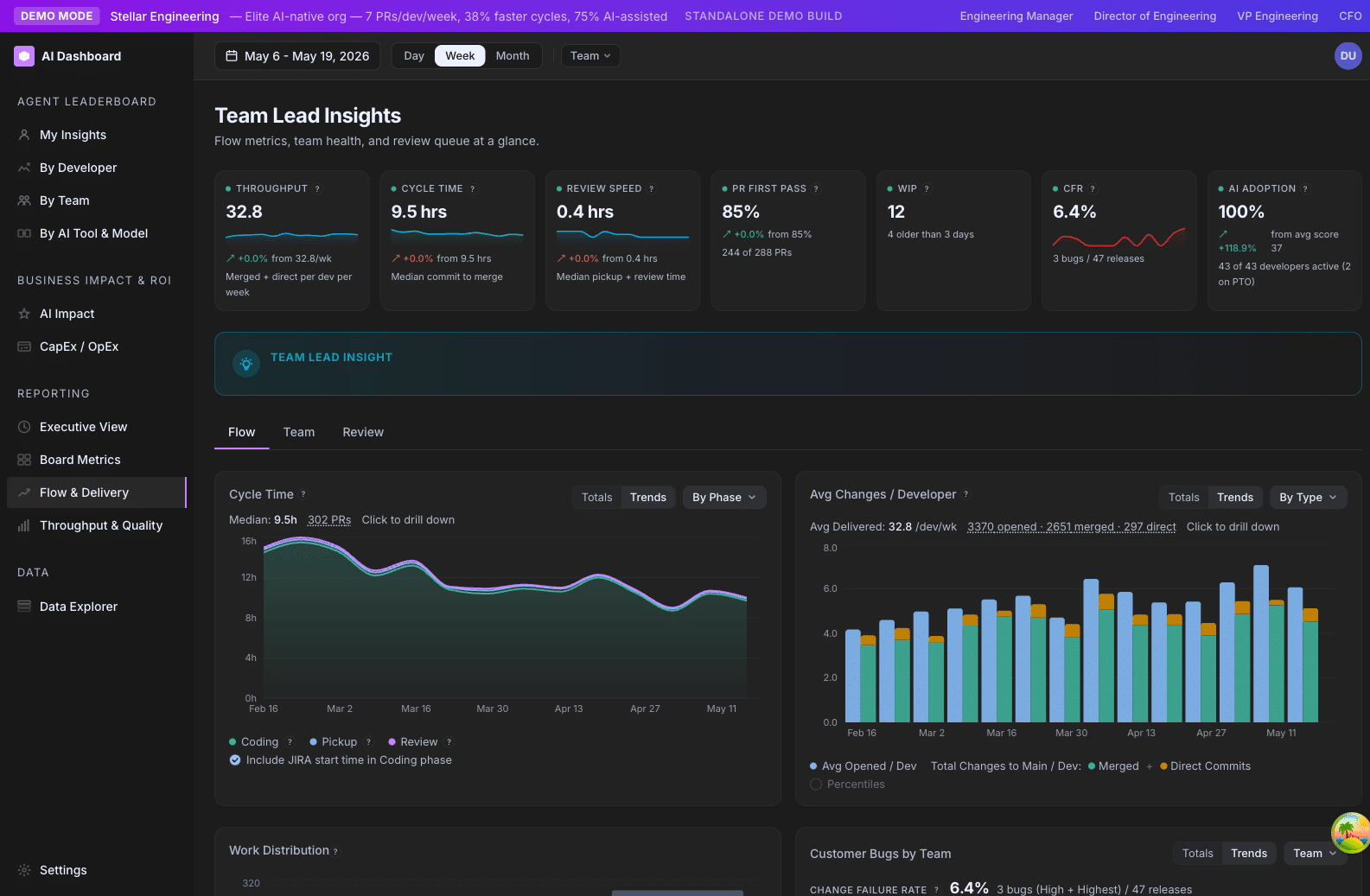
You run one team day-to-day. You want a pulse on flow, blockers, and review health. This page is your weekly toolkit.
Your weekly home: /ai-adoption/teams
Open /ai-adoption/teams with the date range set to the last 14 days. The team table is your dashboard. Expand your team’s row and you get a per-team detail view with the three things you care about:
- Per-developer roster — Adoption Score, Output Score, AI Tier, and direct commits for every developer on the team. A clickable Tier badge surfaces the live tier composite for each person.
- System Metrics — Cycle Time and PR Volume trends with a dimension dropdown (Phase, Author, AI Tier, PR Category). The Cycle Time phase breakdown is where you spend most of your time.
- Repos — per-repo readiness scores. Useful when one specific repo is dragging your team’s Readiness down.
Drill into deeper analyses on /ai-adoption/ai-impact:
- Cycle Time breakdown with Totals / Trends toggle and a phase-by-phase trend.
- PR Volume by Effort, Category, Author, or AI Tier.
- Review Cycles bucketed (0 / 1 / 2 / 3+).
- WIP trend.
- CFR card and trend (if Jira is wired up).
What to look at when
The metrics that matter most for a team lead, in priority order:
| Metric | Where | Why you care |
|---|---|---|
| Cycle Time phase breakdown | /ai-adoption/teams (expanded) or /ai-adoption/ai-impact | Tells you which phase is your bottleneck. Almost always more useful than the total. |
| Review Cycles | /ai-adoption/ai-impact (PR Volume → dimension) | A creeping bucket distribution (more 2s and 3+s) means PRs are getting too big or specs are too thin. |
| First-Pass Rate | /ai-adoption/ai-impact | The clean-merge percentage. A rising number is a strong code-quality signal. |
| WIP | /ai-adoption/ai-impact | If WIP is rising while Throughput stays flat, your review queue is the constraint. |
| AI Adoption | /ai-adoption/teams (per-team) and /ai-adoption/developers (per-person) | Compare to peer teams of similar size and maturity, not to an absolute number. |
| CFR | /ai-adoption/ai-impact | If your team is shipping fast, watch CFR alongside to make sure quality isn’t slipping. |
A useful weekly ritual
A 15-minute Monday review:
- Open
/ai-adoption/teamsand expand your team. Note anything visibly off — a Readiness gone red, an Output Score down 30% week-over-week, an unfamiliar developer in the roster. - Open the Cycle Time phase breakdown. Which phase is biggest? If Pickup dominates, your review queue is the problem and you need a clearing ritual. If Review dominates, your PRs are too big. If Coding dominates, look at WIP and developer-level activity for stalled work.
- Walk your team’s open PR queue in your repo’s native PR list. Look at the oldest 5. For each, decide: ship, deadline, or close.
- Spot the outlier. Did anyone have a noticeably high or low Output Score this week? Five-second mention to yourself, not a public callout. Worth a check-in if it persists into next week.
That is it. Closing five stale PRs per week is the single highest-leverage flow improvement most teams can make.
How to interpret the numbers fairly
A few rules of thumb:
| Metric | Rule of thumb |
|---|---|
| Cycle Time | Under 24h is excellent for small teams. 1–3 days is fine. 4+ days deserves investigation. |
| First-Pass Rate | 60–80% is healthy. Higher than 85% can mean reviewers are rubber-stamping. Lower than 50% means PRs are too big or specs are too thin. |
| Review Cycles | Average 0–1 is healthy. 2+ usually means PRs are too big. |
| WIP | Rule of thumb: 1.5–2× the number of active developers. If your team of six has 25 open PRs, you have a WIP problem. |
| AI Adoption | Compare to other teams of similar size and maturity, not to an absolute number. |
These are starting points, not laws. Your team’s context can move the bar.
What the dashboard won’t tell you
- Whether a specific PR is good or bad. Look at the PR.
- Whether a developer is happy. Talk to them.
- Whether your team is overloaded. WIP gives a hint, but the truth lives in your standup and retro.
Where to drill further
- A specific cycle time problem → Playbook — Investigate a slow cycle time
- A spike in customer bugs → Playbook — Interpret a high CFR week
- A developer struggling with adoption →
/ai-adoption/developers, filter to that person, expand the heatmap.
For admins
Setup, integrations, and the small list of things that keep the data clean. If you are the person who installed Insights or who is the org’s go-to for “why does this number look weird?”, this is for you.
First-week setup checklist
In order:
- [ ] Roster is loaded. Settings → Developers shows every active developer with a display name, GitHub login, and email. Inactive developers from your HRIS are marked
is_active = false. - [ ] Teams are defined. Settings → Teams has at least one team per organizational unit. Departments are populated for grouping.
- [ ] Default Department is set. Settings → General → “Default Department”. This pre-selects the right view for first-time visitors.
- [ ] PTO sync is on.
WHOS_OUT_ICAL_URLis set to your BambooHR iCal feed. The sync runs every 6 hours. - [ ] CFR sync is on (optional).
JIRA_CUSTOMER_BUG_FIELD_IDis set if you want to track customer bugs on /ai-adoption/ai-impact. - [ ] AI provider data is flowing. Open
/ai-adoption/data-explorer, filter toevent_name = user_prompt, confirm rows for the last 24 hours. - [ ] Maturity Factor is sized for your org. Default 0.75 works for most. If you are early in rollout, consider 0.6. If you are mature, 0.85.
The data freshness chain
Every metric on the dashboard is downstream of one of these syncs. If a number looks wrong, the first thing to check is which sync is stale.
| Sync | Source | Interval | Owns |
|---|---|---|---|
| GitHub sync | GitHub PAT | Every few minutes | PRs, direct commits, reviews |
| AI events sync | Snowflake OTEL export (Claude / Codex) | Every 5 min, with 12 h safety lag | Adoption, agentic, AI-assisted detection |
| Cursor sync | Cursor API | Every 5 min, with 12 h safety lag | Cursor adoption |
| CFR sync | Jira | Every hour | Customer bugs, CFR %, MTTR |
| Release sync | GitHub Releases / configured release event | Every few minutes | Deployment Frequency, Lead Time |
| PTO sync | BambooHR iCal | Every 6 hours | On-PTO tier, effective weekdays |
| PR classifier | Internal LLM | Continuous worker | Category, auto-category, CapEx / OpEx, Effort Score |
| AI-assisted classifier | Internal worker | Continuous, with 24 h refresh sweep | is_ai_assisted materialization |
The 12-hour safety lag on AI events sync exists because the upstream OTEL export sometimes backfills events into already-synced time ranges. The lag absorbs that overlap so data is not missed. Don’t be alarmed if you see counts shift slightly within a 24-hour-old window.
The unmatched lists
Two places in Settings → Developers surface “we couldn’t auto-match this”:
Unmatched PTO names
When the BambooHR feed has a name like “Jeffrey Schinella” but your roster has “Jeff Schinella,” the sync drops the name into the unmatched list. Use the combobox to map it. Once mapped, the alias persists.
Unmatched Jira assignees
Same pattern: Jira accountIds that don’t tie to a known developer email. Map them once and future bugs from that assignee will auto-route.
Treat both lists like an inbox. Empty them weekly. An unmatched PTO name means you are miscounting effective weekdays for that developer; an unmatched Jira assignee means CFR attribution is incomplete.
Roster hygiene
The single biggest cause of “this number looks weird” tickets is roster drift. Check these monthly:
is_active = trueshould be a current employee. Offboarded developers should be flipped tofalse, not deleted. Deletion loses historical attribution.- GitHub login is set and matches their actual handle. This is the authoritative join key for PR and commit data.
- Team membership is current. Reorgs happen quietly; your developer table will reflect the old structure until you update it.
- Email aliases are mapped. If a developer has multiple work emails (e.g. from an acquisition), add aliases in their profile so P90 cohorts don’t double-count.
Settings worth a quarterly check
| Setting | Default | Where | When to revisit |
|---|---|---|---|
| Maturity Factor | 0.75 | Settings → General (slider) | When AI Adoption % plateaus or when your org’s actual maturity has clearly outgrown 0.75 |
| Developer Hourly Rate | $75 | Settings → General (input) | Annually, when your finance team updates the loaded rate |
| Baseline Period | Nov 1 last year | Settings → General (month picker) | When you launch a new AI tool and want uplift relative to a specific pre-launch month |
| Default Department | None | Settings → General (dropdown) | When your org structure shifts |
| Tier Weights | 0.5 / 0.2 / 0.3 | Settings → General | When you move from “rolling out” to “extracting value” — see the Set tier weights playbook |
| Direct Commit Weight | 0.5 | Settings → General | When your team’s direct-commit workflow changes (e.g. moving to TBD) |
| Review Weight | 0.5 | Settings → General | When you want to emphasize or de-emphasize review work in Output Score |
| Exclude Chore from Output Score | On | Settings → General | Rarely. Default reflects most orgs’ definition of “real output” |
What to do when a number looks wrong
A short triage flow:
- Is the date range right? Most “this is missing” tickets are sub-7-day windows where rate-normalized metrics widen the benchmark scope or fall back to defaults.
- Is the user being filtered? Inactive developers, alias-only developers, and on-PTO developers don’t show in all views.
- Is the sync stale? Open /ai-adoption/data-explorer, filter by event type, check the most recent timestamp.
- Is the developer mapped? Settings → Developers → check
is_activeand GitHub login. - Are aliases set? A developer with multiple emails will appear split across rows in P90 cohorts until aliases are mapped.
If none of those resolve it, file a support ticket with: the page URL, the date range, the team filter, and a screenshot.
Demo mode
Use Settings → Demo Mode to switch the dashboard into a fake-data profile (Stellar / Launchpad / Atlas) for prospect demos or internal walkthroughs. Demo mode is per-session and respects browser storage — your real data is still there when you toggle off.
For self-contained marketing builds (where there is no real backend at all), set DEMO_MODE=stellar|launchpad|atlas as an environment variable. That short-circuits all API calls and forces a credentials-only login. Talk to your account team for the marketing-build recipe.
Security and access
- Authentication: users sign in through GitKraken’s identity, restricted to your configured organization.
- Role-based access. Org Settings writes are gated by the
org_settings:writepermission. Users without that permission see a banner explaining read-only access and a prompt to ask an org admin or owner. Permissions follow the standard GitKraken role model (Owner, Admin, Member). - Row-level filtering for sensitive views is not yet implemented. All users with read access to the dashboard see all teams and developers. If you need row-level access controls, ask your account manager — it is on the roadmap.
- Secrets. The deployment loads credentials from your secret store of choice (typically AWS SSM Parameter Store or equivalent). Never commit
.env.localor any file containing tokens.
Next
- New here? → Reading your first dashboard
- Have a specific question already? → AI Adoption metric pages
- Need to set things up? → For admins and the Settings reference
