For Executives
Last updated: September 2026
You don’t have time to learn the product. You have time for four numbers and a story. This page is exactly that.
The four numbers
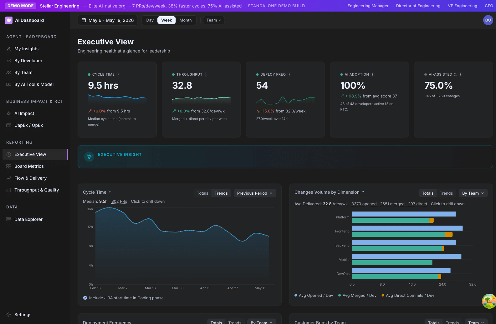
Open /ai-adoption/executive. Five hero cards stretch across the top. The four that matter most:
1. AI Adoption %
Percent of your active developers at Explorer tier or above (score ≥ 25). This is your “how broadly is AI used here?” answer.
Read it as: a leading indicator. Adoption usually moves before output does.
Healthy trajectory: up and to the right, with the curve flattening as it approaches 100%. A flat or declining number deserves an investigation — usually it is onboarding, tooling friction, or a vocal skeptic on a team.
2. AI-Assisted %
Percent of changes (PRs + direct commits, weighted by lines changed) where the developer used AI in or around the change. Different from Adoption %: a developer can have AI installed (counts toward Adoption) without using it on a given change (doesn’t count toward AI-Assisted).
Read it as: a behavioral indicator. The closer this gets to AI Adoption %, the more thoroughly AI is integrated into actual work.
3. Cycle Time
Average hours from a PR’s first commit to merge. The single best operational health metric in the dashboard.
Read it as: a trailing indicator of flow. If cycle time creeps up, look at WIP and review-cycle counts.
4. Throughput
Number of merged PRs per week, normalized per active developer.
Read it as: volume of shipped work. Read alongside Output Score (effort-weighted) — Throughput is “how many things”; Output Score is “how much stuff.”
The fifth card, Power User Growth, is your quarter-over-quarter trend on how many developers moved into the top tier.
How to read the trend lines
The executive view has six trend lines below the hero cards: Cycle Time, Throughput, Deployment Frequency, CFR, AI Adoption, and (when configured) Customer Bugs.
The single most useful reading pattern: look at adoption trend and cycle time trend together.
- Adoption ↑ and Cycle Time ↓ → AI is delivering. This is the story you want to tell.
- Adoption ↑ and Cycle Time flat → AI use is increasing but flow hasn’t caught up. Usually a review-bottleneck issue.
- Adoption flat and Cycle Time ↑ → Operational drag. Investigate WIP, headcount, scope.
- Adoption ↓ and Cycle Time ↑ → Compound problem. Likely a morale or attrition signal — talk to your engineering leaders.
What to put in your monthly report
Three lines, in this order:
- The headline. “AI adoption climbed from 62% to 71% this month, while cycle time dropped from 4.1 to 3.4 days.”
- The story. Why it moved. Did you ship a training? Did a new team onboard? Did you launch Codex alongside Claude?
- The next bet. What you are going to push on next month. “Next month we are focused on the Platform team — currently 40% Emerging, target 70% Explorer+.”
The dashboard’s job is to give you the first two. The third one is your call.
What not to do with the dashboard
- Don’t show individual developer scores in your monthly report. It will get someone fired by a different chain of command than the dashboard was designed for. Aggregate by team or by tier mix instead.
- Don’t read a single week. Engineering work has 2–4 week natural cycles. Read trends, not weeks.
- Don’t quote ROI to the dollar. The Productivity Uplift number is a directional estimate. Use it for order-of-magnitude statements (“low single-digit millions in annualized productivity gain”), not for finance.
Where to drill further
If you want one more level of detail:
- For “is AI actually paying off?” → Productivity Uplift
- For “where are we slow?” →
/ai-adoption/ai-impact(Cycle Time phase breakdown) - For “which team needs attention?” →
/ai-adoption/teams